How accurate are Canada’s leaf symbols?
It’s been a year of leafy patriotism for Canada’s 150th birthday and of course our favourite leaf from our national tree—the maple, has been proudly displayed on everything from Tim Hortons cups to souvenir t-shirts, mugs and some flyer I found in my mailbox from a slightly shady duct cleaner advertising a celebratory rate in honour of the event. Even the Toronto Maple Leafs got into the act by celebrating their 100th year with a restored version of the vintage leaf featured on sweaters during their glory days of the ‘40s.
But have you ever looked at some of our most well-known symbols and wondered what species of maples they are?
Well, it’s an interesting exercise for tree fanciers but for the most part it’s a mystery because many of them have been stylized into something so ambiguous that it’s hard to tell whether they are from an actual maple tree or one of the countless shrubs, herbs and vines that have more than a passing resemblance to the species.

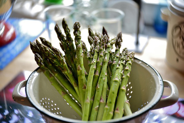
The Norway maple, above, masquerades as the Canadian sugar maple. PHOTO: Steven Chadwick
But there’s certainly nothing ambiguous about the realistic maple leaf featured on our new polymer banknotes. The foliage floating around on our folding money is easily identifiable as a non-native Norway maple (acer platanoides)—a tree with a reputation for being an oafish thug and highly invasive weed that is doing its best to knock off our native forest plants. Of course, when botanists first spotted this alien invading our currency it caused a bit of a brouhaha and a lot of embarrassment for the Bank of Canada who I suspect will quietly remove the offending leaf when the notes are eventually revised.
The leaf on the Canadian flag is generally accepted to be a stylized version of an 11 point sugar maple (acer saccharum), but I have colleagues who insist that the design was inspired by a wind tested immature Norway maple. Both leaves can be almost identical at certain stages of development, but I would have to say the Norway can be eliminated because its characteristic fourth and fifth lower lobes that are noticeably absent on the flag. Having native sugar maples grace our national symbol may seem appropriate, though slightly exclusionary to some. That’s because like most of our other native maple trees, the range of our ‘flag’ maple is limited to Ontario, Quebec and east to Nova Scotia, so patriotic Canadians living west of Winnipeg would be hard pressed to find an example growing in their local forest.
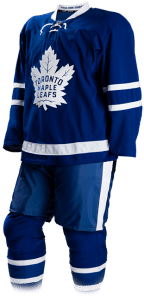
The Toronto Maple Leafs 2017/18 uniform
You either love or hate that familiar triangular and prickly official Canada 150 logo. I happen to be in the latter group, because to me, the design almost looks like it belongs on the head of the Statue of Liberty. What kind of leaf is it? If I had to take a wild guess think I would say that it is a frankenstinian mashup of that pesky Norway again, superimposed on top of a sugar maple that is trying to peek out from behind the bigger spikes. I don’t want to be too harsh here, but the multiple spines on the thing looks as though it is either about to bite me or poke my eye out, so for leaf identification purposes let’s go out on a limb and call it acer frankenstonium sp. ‘Mary Shelley’.
It may be blasphemous to question the judgment of the Toronto Maple Leafs—although there seems to be plenty of that going on when they lose four or five games in a row. But since we are wasting our time trying to identify unidentifiable leaf species I have to say that the long, narrow and heavily toothed leaf on their new/old jerseys is a bit of a baffle. If you put your eyes slightly out of focus the serrations might give it a vague look of an elderly red maple, but in focus, it has an uncanny resemblance to the foliage from a wild gooseberry (Ribes lacustre), or possibly a ninebark (Physocarpus opulifolius)—and maybe even a passing likeness to that parsley leaf I found floating around in my soup the other day.
I understand the front office reasoning for reintroducing the vintage leaf as a warm and fuzzy nostalgic reminder of the Conn Smythe glory days of the ‘40s, and explain that the 13 veins at the top represent the club’s 13 Stanley cup victories, but I still prefer the more familiar flag-inspired sugar maple logo.
Not to worry though—leaves change with the seasons, victory is sweet, and when the club wins their 14th Stanley cup this season they will have to add a 14th vein and maybe even go back to the ‘sugary’ maple they had in ‘67.
Steven Chadwick is a professional gardener, horticulturist, and long-time Beach resident.