New data reveals 12-year gap in life expectancy across neighbourhoods
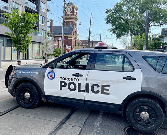
Residents in The Beach enjoy an average life expectancy of 81.3 years, ranking the community at number 62 out of a list of 158 neighbourhoods city-wide in terms of longevity. Photo: Susan Legge
By MATTHEW STEPHENS
Toronto has one of the highest life expectancies globally, yet a 12-year age gap exists between neighbourhoods, meaning some residents die much earlier based on where they live.
This past October, the digital publication The Local released findings from a collaborative research project conducted by scientists at MAP Centre for Urban Health Solutions at St. Michael’s Hospital. The monthslong study has shed light on average life expectancy throughout the 158 neighbourhoods of Toronto.
Using data from the 2021 census, as well as 2020 and 2021 provincial death records, studies show that people from wealthier neighbourhoods like the Bridle Path and Bayview Village live longer than those from less affluent regions like North St. James Town and Moss Park. But where do our faithful Beach Metro readers rank on that list? Although each of our coverage areas is relatively close to one another, an intriguing contrast in life expectancy paints a rather interesting picture.

According to the data, East Toronto neighbourhoods rank somewhere between the middle to lower end of the all-encompassing list; with East-End Danforth, Woodbine Corridor and Birchcliff-Cliffside ranking closest to the bottom at 148, 151, and 154, respectively. The average lifespan from these areas ranges from around 77 to 78 years.
Closer to the top of the study’s ranking at 62 and 64 are The Beaches and Cliffcrest, whose residents have an average lifespan of around 81 years. Next on the list is Danforth East York, which drops all the way down to 106 on the list, at an average lifespan of 79.9 years.
What’s interesting is that the average life expectancy for women always exceeds that of their male counterparts who never made it past the 80-year mark.
According to The Local, among the several factors that determine life expectancy, financial prosperity was highlighted as the main contributor.
“Wealth brings privileges, and one of them is longer life,” Dr. Stephen Hwang, a physician and researcher on homelessness, housing, and health at St. Michael’s Hospital, told The Local.
Comparing East Toronto’s highest-ranking neighbourhood to the lowest using data from Canada Mortgage and Housing shows a significant economic gap in average household income – a $27,600 gap to be exact.
The Local mentions that access to services like health care, public education, and social assistance, are just some of the other speculated factors determining life expectancy across the city.
Fear not, readers. Although the highest ranked neighbourhoods in East Toronto appear to outshine those closer to the bottom, the difference in life expectancy is only about four years. However, when compared to Yonge-Doris — an average-income neighbourhood in North York with a whopping average lifespan of 86.2 years — it begs one to question why such glaring disparities exist.
According to researchers, this phenomenon is known as the “healthy immigrant effect,” where newcomers from higher socio-economic backgrounds bolster life expectancy within the region they live. In Yonge-Doris, 64 per cent of the region’s residents are immigrants.
As for the rest of the city’s neighbourhoods, The Local believes that more support at the provincial and federal level are required to ensure public health and close the vast mortality age gap across Toronto.
“Obviously this is a public health kind of issue,” Hwang told The Local. “I know that Toronto Public Health has always championed an approach of addressing priority neighbourhoods. It would be great for them to carry this forward, so that it’s not just a one-time thing, but something that gets built into our public health strategy.”
The full story on The Local can be found here.